interior
This week You! takes a look at the awe-inspiring interiors of a newly-opened store in Lahore which is a fusion of classic design with a contemporary twist…
From telling the brand’s story and creating immersive experiences to putting together head-turning displays, attention to detail is paramount when it comes to designing a retail store. Occupying two floors of a modern structure, located in Mini market, Gulberg, Lahore; the store interior for ‘Afsaneh’ has a vibe of a strong cultural aesthetic that one has to set some time aside to browse. The word ‘Afsaneh’ brings memories of the old world when things were simpler, long lasting and a lot was left to imagination.
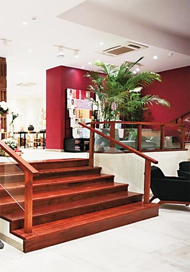
The interior design of the store is a brain child of Lahore’s brilliant team SR Design Works (SRDW) under the aegis of Architect Rashid Rasheed and Project Lead Zara Hafaz. Coincidently, the flagship store is housed in a building that was designed by SRDW a few years ago. “We were familiar with the space already when asked to design its first store. It was a great challenge to create a well-performing store amongst the many others surrounding the location. It is a split-level space which makes it interesting visually; all three levels have natural light and it is all visible as soon as you enter. The well-placed merchandise is segmented into open spaces, combining the multiple levels,” tells Rasheed.
Indeed, the newly launched label is best known for its sensible fusion of the contemporary with rustic and exotic. The collection encapsulates a take on the classic with modern chic designs that are complemented by ethnic detailing displaying cross cultural influences. The brand is a unique creative collaboration between Khadija Shah and Rehan Bashir backed by a Multan-based textile mill. “Our design philosophy centres on sub-continental art, craft and culture; diverse identities are explored along with local narratives and folklore celebrated and re-imagined through our apparel. We believe we need to look no further than our own heritage which boasts of rich textiles, bright hues, exquisite silhouettes and traditional cuts. Ours is a fusion of classic design with contemporary twists which makes it a unique entity on the high street today,” shares Khadija Shah.
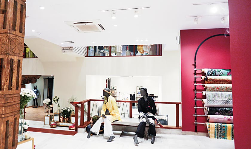
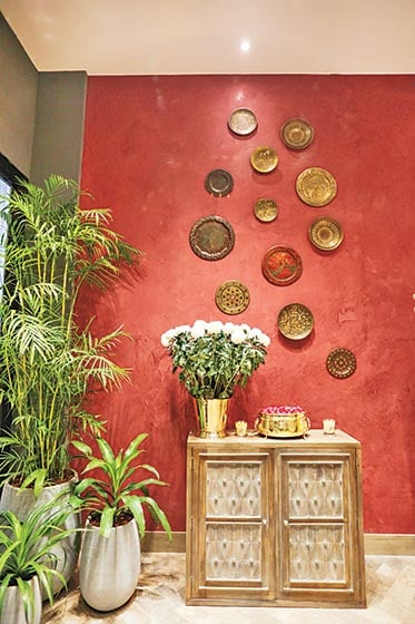
Speaking of the store, works of passion adorn the interiors and gives more definition and character to the space. The use of ethnic elements with original sculpted columns from Gilgit-Baltistan and Swat, hand-baked Muradabadi enamelled plate tiles, engraved brass plates and the rich hues of the walls reflect the brand’s ethos and a testament to the love for all things eastern.
“The objective was to preserve the craft and the craftsmen who are no more. Yet, the elements and the motifs might help visitors understand what we had, and the need to preserve and appreciate it,” adds Khadija.
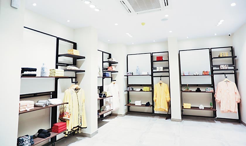
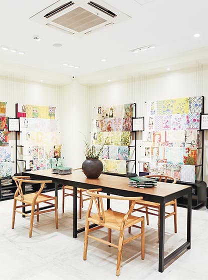
Thriving on its ample use of wood with a strong emphasis on preserving craft and skill, the store’s eclectic ambience invites attention. It is the sort of place where one finds impeccably placed merchandise, which boasts of design with strong emphasis on finding the right balance.
“We wanted a real space. An original space that evolved as we designed and little bit was left to the imagination of other participants in the design. Designing a space is always a teamwork and not one person’s vision. What you draw and what it translates into has a lot to do with crafts and people who put everything together,” explains Rasheed.
With the attention to detail, Afsaneh is not something that was done up in a rush. “It was done at a slower pace but it was done properly. We had time to experiment and develop displays and fixtures which would be practical and last a long time. We wanted to keep the old world feel while keeping the utility modern and practical. In the race for making a store better or different from competitors, sometimes designers forget about their design which is the key,” he says.
There’s richness to the store. The light travels in all floors which is further complemented by floor vases holding bouquets of flowers, small benches placed around for the customers, and dark shades of hues surrounded by the wooden columns. It also is a reminiscent of a decorative arts collector. The front facade of the store interior is done up heedfully with an eye-catching art installation at the main display window. Although slabs of white tiles, polished brass elements and plenty of dressers adorn the palette, the retail setting looks immaculately put together with planters and lighting fixtures. The store is sliced into separate sections by a series of partition created in a space that imbued the ethos of the brand. It provides customers with a sensory experience that enables them to connect and appreciate the products fully.
While talking about a very important point in designing the store, Rasheed elucidates, “In the near past, banks and companies bought original art by famous artists and took pride in owning them. They were commercial ventures but there was a space and appreciation for arts and crafts. I have seen the original Sadequain murals in the most surprising places. The thought that relevant original art and things from the past can be a part of a retail space makes me excited, so we thought of incorporating a bit of original art and traditional craft brought from other places. For me, memories formed are long lasting than just seasonal collections in a shop.”
Each floor reflects a different narrative – one that weaves across all aspects of the brand; utilising forms, colours and brand identity as stimulus from collections to the store’s ambience, each piece is considered a labour of love and truly a unique work of art. The inspiration remains indigenous driven from eastern arts and culture.


